Creating a Media Kit for your Blog - Designing the perfect Media Kit + FREE Template
/Media kits.
Those scary things that only the big & successful bloggers have.
Those intricate pieces of design that must have cost a fortune for a graphic designer to whip up.
Are these the things that come to mind when you think of the term 'Media Kit'? Some might view media kits in this way, but I try and view a media kit as a simple 'CV' for your blog.
If you have no idea what a Media kit is or why you need one, then click here for a great post by Glamorous Glitter
No matter whether you are a newbie blogger with only 5 fans on Facebook, or someone who has been around for a while and has thousands of followers, you need a Media Kit.. You might be a mix of the two, having been blogging for years but struggling to grow your readership & social media following. No matter where you are in the blogging game, having a media kit shows you take your blog seriously, that you are professional, and that you mean business (even with your 5 Facebook likes!).
You didn't hear this from me, but it's all about faking till you make it in the blogging world. If you come across as professional with a beautifully crafted media kit filled with the right info that brands are looking for, then those same brands are more likely to want to work with you than if you send them a handwritten stats card with a bunch of scribbles on it. It's simple really.
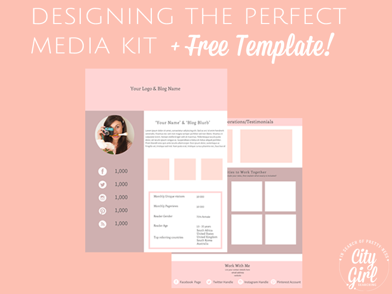
And don't let the idea of a 'beautifully crafted media kit' freak you out. This is where I step in and share with you my free media kit template (grab it at the bottom of this post!) for you to download and tweak to fit you and your blog.
I've included some points below on what goes into the perfect media kit below, but you'll also want to make sure that you read THIS POST by Glamorous Glitter. Imka (the beauty & brains behind Glamorous Glitter) has gone into a lot more detail on Media Kits. Imka really knows her stuff when it comes to blogging (she is an SEO expert, has an awesome guide to marketing your blog) and will really help you nail down what you need to do get your blog seen by more people. She's also a really lovely lady and I just know you'll enjoy her blog and learn a lot from it.
What goes into the perfect media kit?
Make sure you pin the graphic below to help you remember what you need to include to create the perfect Media Kit!
Here is a list of what goes into the perfect media kit:
- Profile Photo - keep it updated & relevant to your brand/blog.
- Your Logo
- Short Bio of you & your blog - how old your blog is, what do you blog about, do you host a blog series that might interest the brand you are approaching (change this according to whom you send your media kit to).
- Analytics - Use google analytics (or if you blog with SquareSpace, the platform has it's own great metric measurer). Keep this brief and focus on your monthly page views for the previous month & your unique monthly visitors.
- Statistics - Your following on Facebook/Twitter/Pinterest/Instagram/Youtube/Periscope/
- Images - break up your media kit with images from your blog (these ideally should be your own images). This gives anyone wanting to work with you an idea of the quality of your blog posts.
- What your blog Offers - Your media kit is something you use to sell blog (& your product/services). So it’s important that you convince brands that you have something amazing to offer. Make sure to include what sort of opportunities you are available for (guest blog posts/advertising/sponsored posts/recipe creation are some ideas). Include examples of previous collaborations & testimonials from clients/brands to show how much value you can add to the person you are contacting.
- Who are Your Readers - info on the demographic of your readers (their age, what country they are based in, gender)
- Contact Info - how can people get in contact with you (your email address/telephone number/blog url).
- Social Media Accounts - make it easy for people to find you on all your social accounts (include your Twitter handle/Facebook page name/Pinterest Account name/Instagram handle).
The design of your Media Kit
Some things to keep in mind when designing your media kit.
- Your Branding - keep your branding consistent, especially with your Media Kit. Use the same colour palette & fonts as your website.
- Make it interesting - avoid long paragraphs. Use text boxes, images & bullet points to break up your text. Using images and graphics to break up your text makes your media kit stand out and helps people remember you.
- Save as PDF - save your media kit as a PDF so as it can't be altered with. Include a link to download a free PDF reader (like Adobe) in your email for anyone who may not be able to open up PDF's.
- Length/Size - try not to cram too much into one 'page'. Also condense your information. A media kit is a CV for your blog. Keep this in mind and remember that the recommended lengeht of any CV is two pages. Any longer and you run the risk of boring/overloading people. Rather put your information on two seperate pages and combine them into a PDF so that it looks professional and is easy to follow/'flick' through, like an actual CV.
- Use images/graphics to break up your text - this makes your media kit stand out and helps people to remember you
And now for the good stuff: Your FREE Template
Do you want to get your hands on a FREE MEDIA KIT for your blog? Simply enter your details below to be sent your free template today. I designed this free, feminine inspired template just for you. I hope you find it useful and it helps you to show show off your blog. If you love this template as much as I do I would love it if you could share it with your followers...simply click the share button below <3
Here's to helping you create the perfect media kit for your blog!
x


