5 Quick Blog Makeover Tips
/Is your blog feeling a little stale? Are you in need of a bit of a refresh when it comes to your blog design and layout? Here are 5 quick tips to help you breathe new life into your blog, quickly and easily without the need to hire a graphic designer. I found making these quick changes with my own blog really helped me to feel inspired again and I'm sure would do the same for you.
1. Change your Social Media Icons.
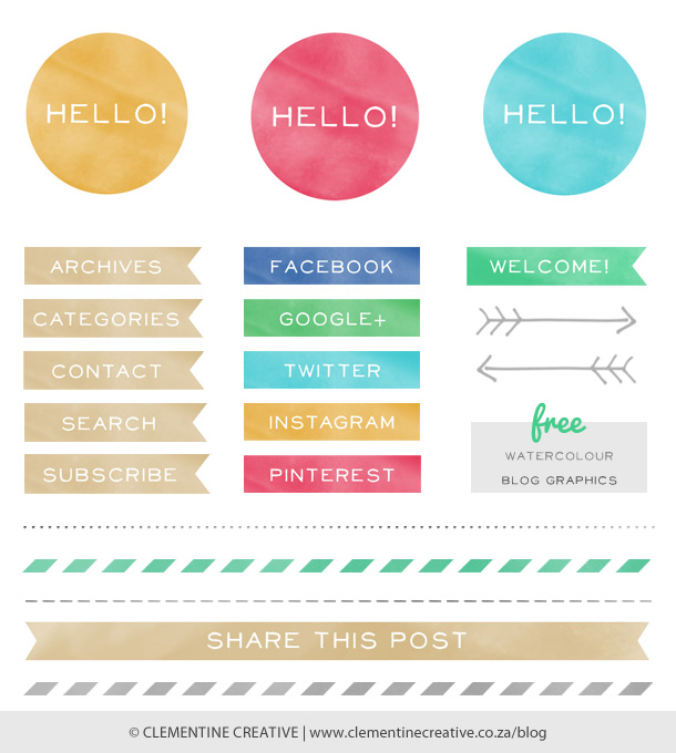
This could be something as simple as changing the colour of your social media icons or could even extend to changing the design of them completely. There are so many wonderful blogs offering free icons for download that you don't have to be stuck with boring icons ever again. Here is a quick list of some of my favourite ones. Just click on the images below to be redirected to the website:
2. Change your Blog Sidebar Labels.
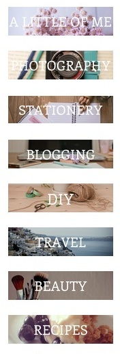
A similar move to the tip above, but changing the design of your category/page labels can really give your blog a lift. Think about changing the font, the size of the font, the background colour, adding a photo as the background or going minimalist and just using a font.
You can make new sidebar labels yourself using the following free online programs; Canva and PicMonkey. When you do make your own labels just keep in mind the sizing of each one. Try and keep the size (and the design) the same to create uniformity on your blog.
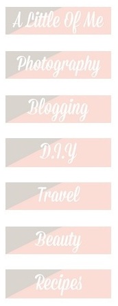
For me, I changed my image based labels to graphic based labels as I thought the images were distracting from the main content of my blog. I still like the image based labels on the left, but felt like I needed a bit of a change. Remember, it's your blog and if you make changes you don't like, you can easily go back and change them again:
3. Change your profile picture.
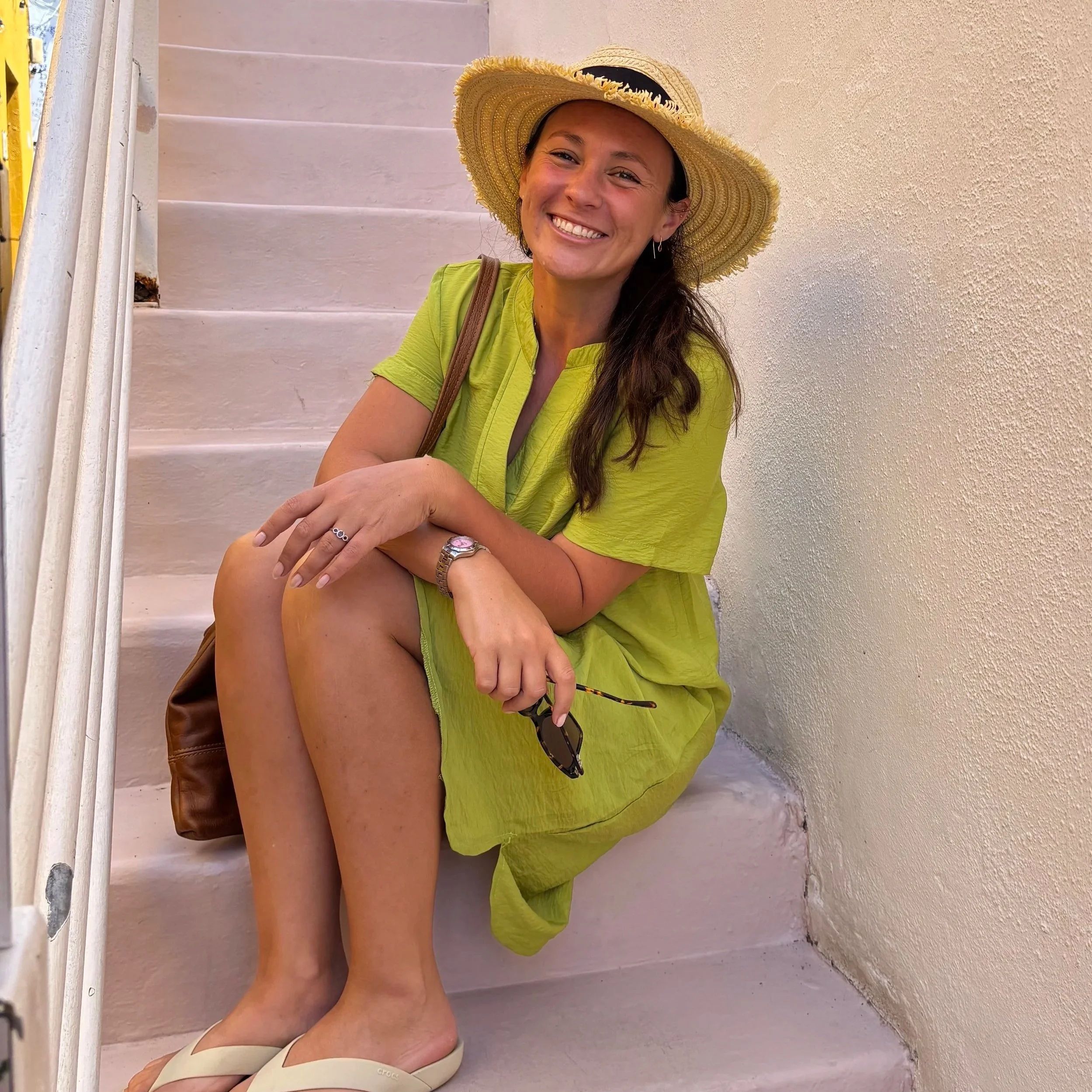
Update your profile picture every once in a while to keep your blog fresh. Or if you don't have one, add one! Your readers want to know who it is they are connecting with when they read your blog. Try to keep your colours in the same palette as your design theme to avoid distracting from your blog too much. I styled a few new photographs recently using items that show what it is I blog about. Be creative and most of all be you!
4. Remove the clutter.
Take some time to really look at your blog. Are there pages, widgets, buttons and other things in your side bar or header that you don't really need? Remove them and just keep the essentials. A great tip to implement is to include a search bar somewhere obvious on your blog. That way if people get a little lost (or if they are looking for something specific they can quickly search your blog instead of spending time getting frustrated and then ultimately leaving). Make your blog a pleasant and easy to navigate place for your readers.
5. Add a Landing page
A landing page (or home page) is the first thing people see when they get to you blog. You may have multiple pages on your website (for example an About Page, Store Page, Contact Page, Press Page) or you might also have your blog set up as a separate page too as is the case with my blog. This can be very confusing for people who stumble across your website as they may have no idea what it is that you blog about. To make it easy for them to navigate, add a 'Home' page to your site. If you click on my logo at the top of my blog, or if you click on my actual 'Home' page you will be directed to a space that is clean and free of clutter. Your Home or Landing page needs to be very clear in stating what your webiste or blog is all about, as well as providing easy to see and use links to the different parts of your site.
As you can see my Home page has links to my About page, my Stationery Store, my Photography portfolio and my Contact page while also providing a sign up form for people to subscribe to my blog. Another thing to remember to include is your social media links so people can connect with you on all the platforms you use.
My site is run on SquareSpace and so setting up a landing page (or cover page as SquareSpace calls it) was super easy to do. If you blog using Wordpress or Blogger you can set up a new 'Static Page' which can act as your landing page.
Remember at the end of the day you want your site to be easy to navigate and easy for people to find what they are looking for. You don't want people to get frustrated and end up leaving your site because they found another one that is better to navigate. People are also very visual, so try to include high quality photographs on your home page that add to the overall branding and aesthetic that you want to convey to your readers.
Do you have any other tips for a blog makeover that you'd like to share? I'd love to hear from you in the comments below!
You might like these posts too:


