Why you need a 'START HERE' page for your blog
/Have you ever clicked a link for something on Pinterest, and then been redirected to the home page or blog of that site only to have no idea what you're looking at? So many times I get lost on blogs, looking for something in particular that I saw on Pinterest, only to give up a few seconds later and click away. You may think your blog is incredibly user friendly, but that's because you designed it and know where everything lives.
If someone was visiting your blog for the first time, would they know, just from the first few seconds, what it is you do and what you offer or sell? It's so hard to look at our own blogs objectively, so why not make it super easy for people to find their way around your site by adding a START HERE page (see image below):
Your Start Here page is another opportunity (just like your About Page & Home Landing Page if you choose to have one) for you to tell your readers what is is you do, and to give them a brief summary of your business or blog. I use my Start Here page as a place to show my blog categories, and as a way to have people sign up for a particular email. I am starting a new email list of people interested in improving their photography for their blog or business, and so use this page as a place for them to sign up. Some people use their Start Here page to sum up their previous blog posts, to answer FAQ's or to share more about themselves.
A few months ago I found a platform called Peek that allows you to submit your website to a panel of random testers who visit your site and answer specific questions about your sites usability. Once you enter your web address and email address up (it's free!) you are then sent a 5 minute video of people testing out your site, their first impressions and their answers to a few questions about the functionality of your site as well as whether you can improve on anything.
My site was sent first to an older gentleman who really had no idea what I was writing about. At first I was so frustrated watching him make his way around my blog, but then I realised that my site was confusing. He thought the beauty reviews I did were for products I actually sold, and kept trying to find where to buy them. As the first blog post he saw when he clicked on my site was a review for a beauty product, he thought I was a selling skincare & makeup.
PRO TIP: Your latest Blog Posts conveys a lot to your readers and can influence their decision to stay or leave your site
I was happy to see he was actually interested in buying the product after my review, but I was disheartened as I soon realised he had no idea what my site was all about. At that time I even had a Home or Landing page set up, but as I use a lot of images in my design, it took so long for the Home page to show the images that he quickly clicked straight to my blog. I realised very quickly that you need to assume everyone who arrives at your blog (whether they are first time visitors or returning visitors) needs clear instructions about where to click and where to find information...
PRO TIP: This is why SEARCH BARS are so important in your blog design!
The next person to view my site was a young woman who clearly was a blogger herself. She immediately found her way to my blog and my about page, and proceeded to navigate my site with ease. As much as she liked the functionality and white space of my blog design, she did comment on how long the images were taking to load and that she found it rather frustrating. I have since learned to decrease the size of the images I upload, in the hopes that the loading time doesn't scare off my visitors!
So, by implementing a 'Start Here' page on your blog, you are giving your readers one more place to be able to find out about you and what you can offer them. It also helps them to learn how to navigate your site, and in turn, will make them more likely to stick around and come back.
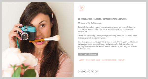
I am STILL tweaking my blog design (that's why I love SquareSpace so much as I am able to customise so much without having to know ANY code) and I think I will continue to tweak the functionality of it as I go along. I have just added a Home/Landing page back to my site (see image above). SquareSpace gives you the option to add easy-to-customize landing pages to your site in just a few minutes. I have chosen to introduce a landing page because I have been told me that this site has so many different things going on that some of my visitors feel rather overwhelmed and unsure of where to start when they first arrive. We can't assume everyone who lands up on our site will be a well seasoned blogger.
Do you have a Start Here page on your blog? Have you ever tried a user testing site before? How do you feel about your sites functionality and user-friendliness? I'd love to hear from you in the comments below!


