Nursery Tour - a tour of Aaron's modern celestial inspired nursery

nursery tour of Aarons modern celestial inspired nursery baby room citygirlsearching-01-01.png

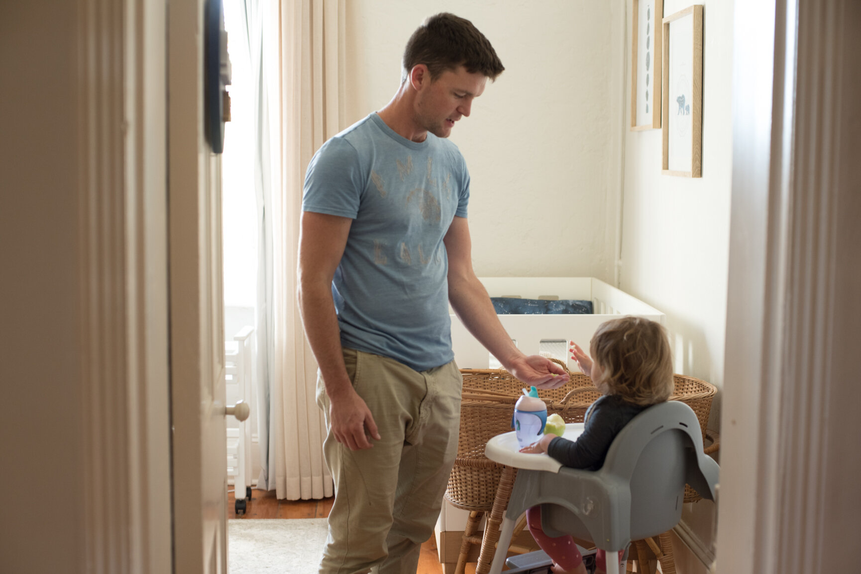
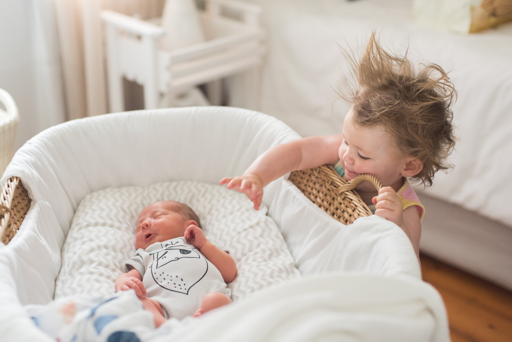
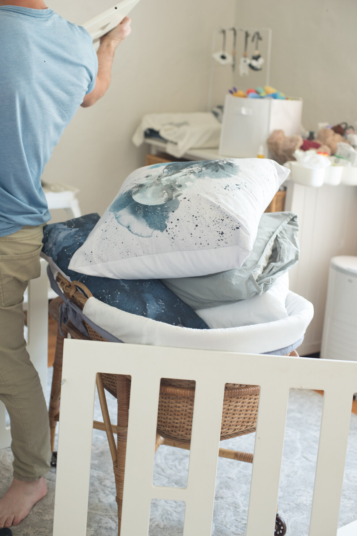
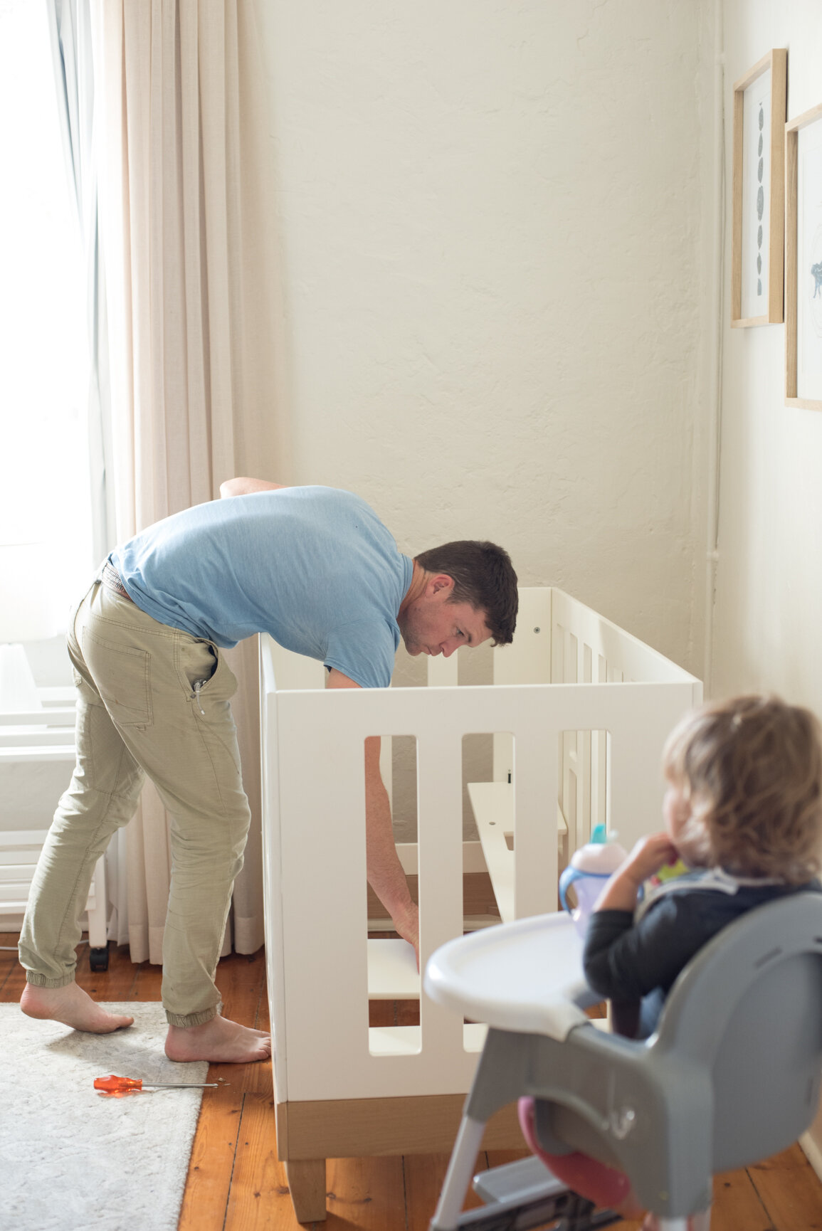
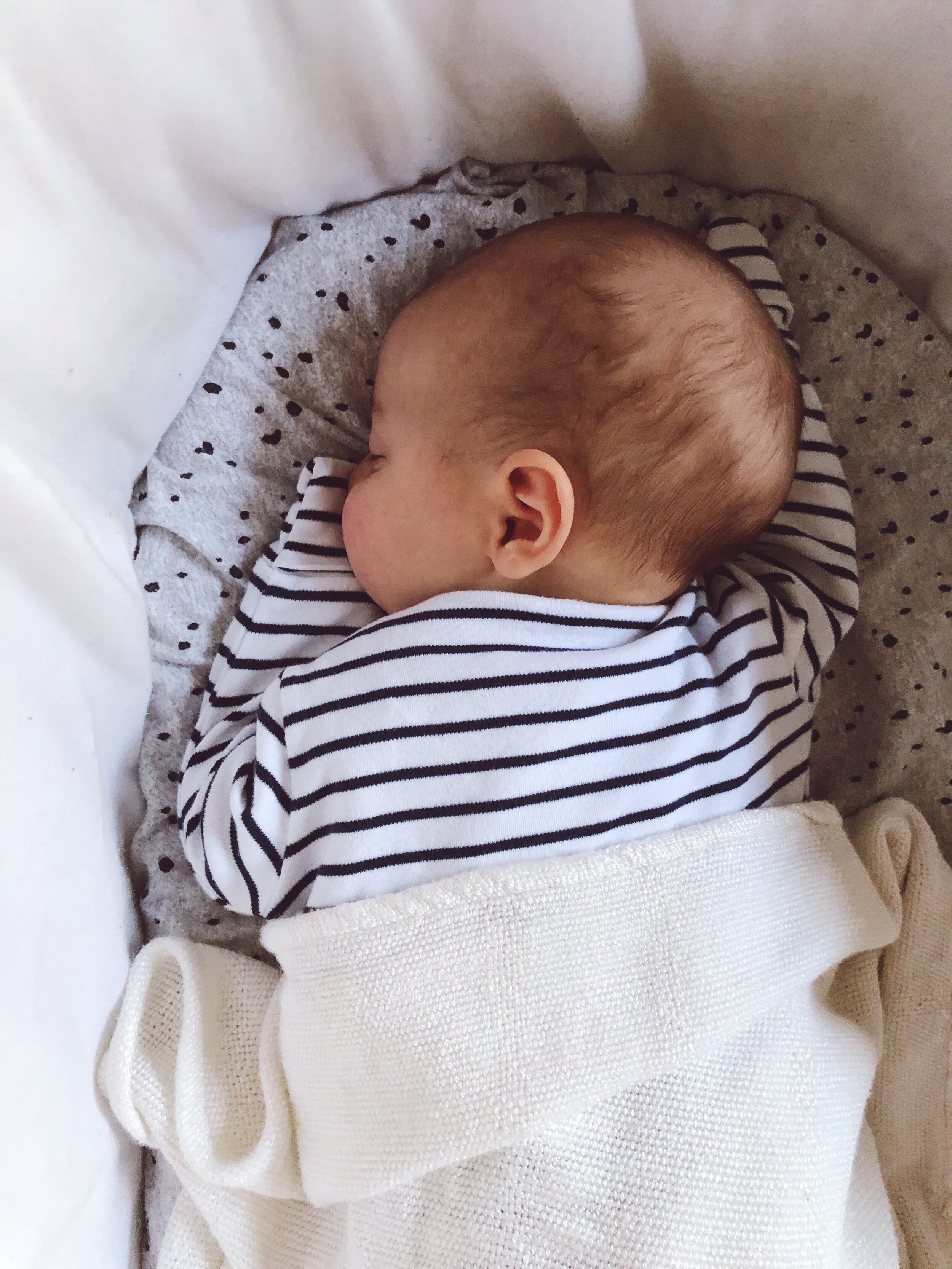
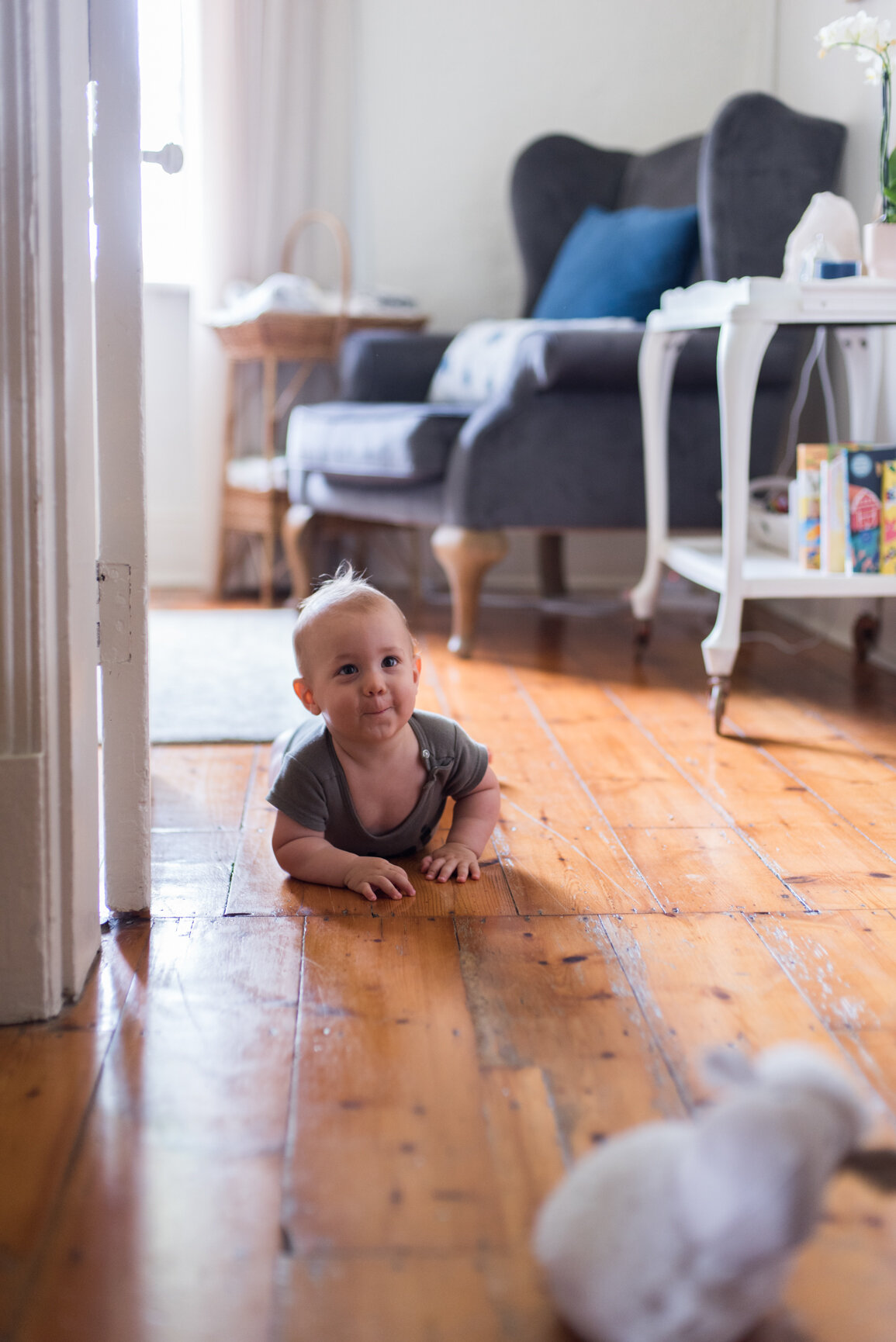
Aaron is nearly a year old (whaaaaat?!) and I have been wanting to publish this post since he was a teeny tiny newborn, mostly so that I could capture his gorgeous bassinet (a very special family hand-me-down) but alas, 12 months have flown by and here we are. I will share a few older photos of the room in those early days & months, as a few things haven’t changed. The biggest change came when moving him from the bassinet into the cot, as that is where Everly was sleeping once we took the sides down and converted it into a toddler bed (click here to read a full post on making the transition from a cot to a toddler bed).

When Aaron was sleeping in the bassinet, I had a single sized bed in his room which worked really well as a guest bed (mostly used by my Gran when she came to visit) and it worked nicely as extra seating when people came over to visit. I’ve got some very special photos of my mom and Everly & Aaron in the first few weeks, and that bed was the perfect place to sit and drink tea.

Once Aaron moved into his cot, the bed was moved into Everly’s room and she moved from the toddler bed into the big bed. It was a great swop!

Everly & Aaron (9 of 14).jpg

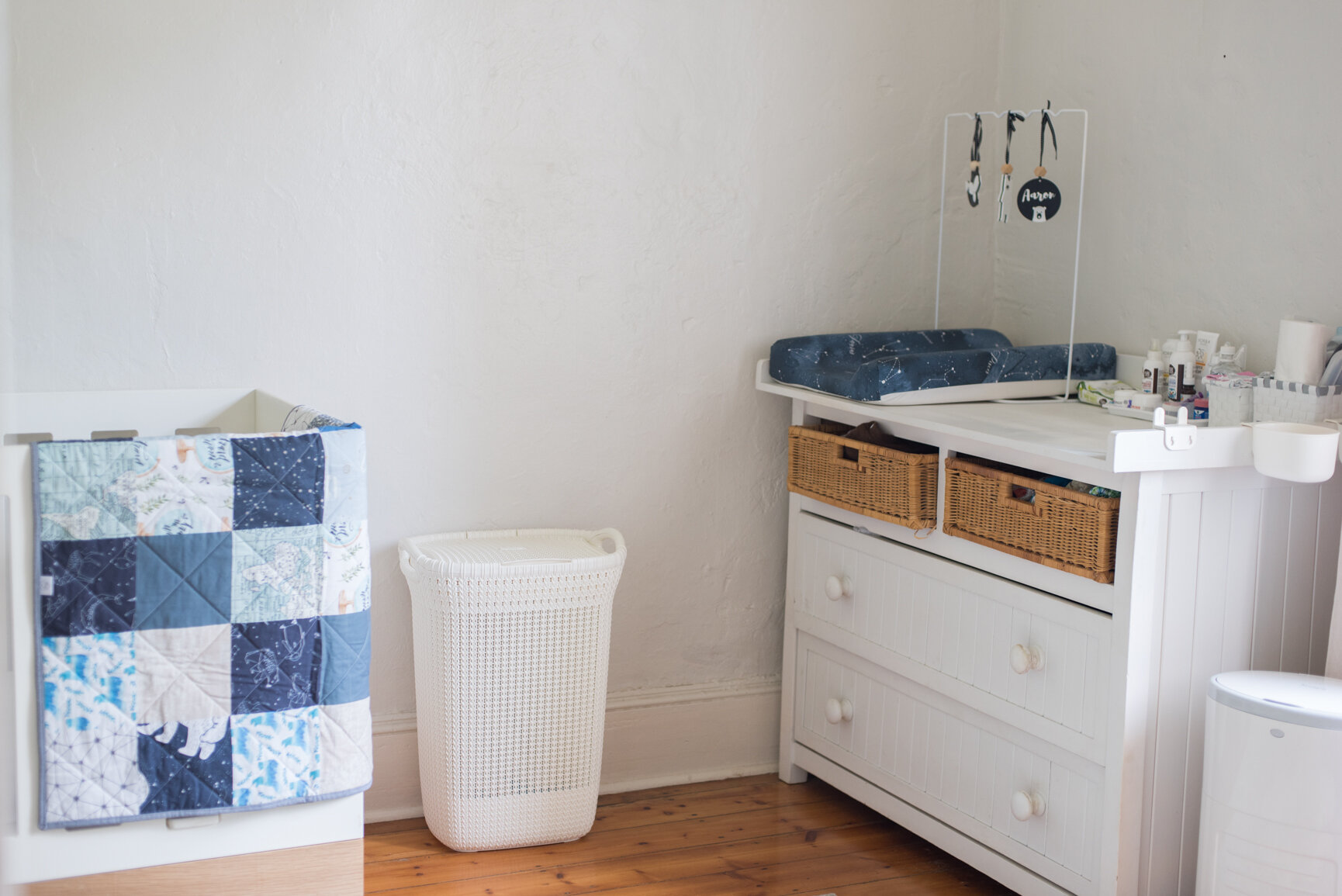
I spent, as I’m sure most pregnant ladies do, a fair amount of time on Pinterest trying to decide how I wanted to decorate Aaron’s room. I loved the idea of a space theme, but wasn’t very keen on the traditional rockets or planets, and then I stumbled across a beautiful lampshade that had the Ursa Major constellation , aka the famous polar bear and I fell in love. And so, I decided to follow a loose constellation theme for his room, with a lot of white, grey, blue and a touch of brown as those colours were brought in by most of the big furniture from Everly’s room.

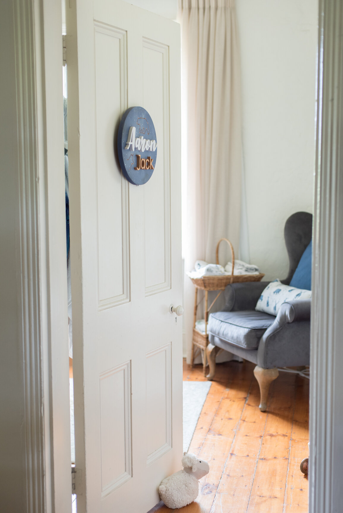
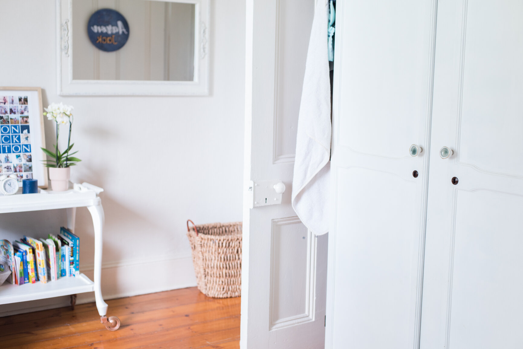
When Aaron arrived early, just like his sister at 38 weeks, I didn’t have everything in it’s place and things stayed like that in those first few weeks. Once I took the pressure off myself, I was able to add little bits and pieces to really bring the whole look together…like the name plaque on his door.

I’ll link all the suppliers/brands at the end of this post to make it easy for you to look them up if you see something you like.

The details…

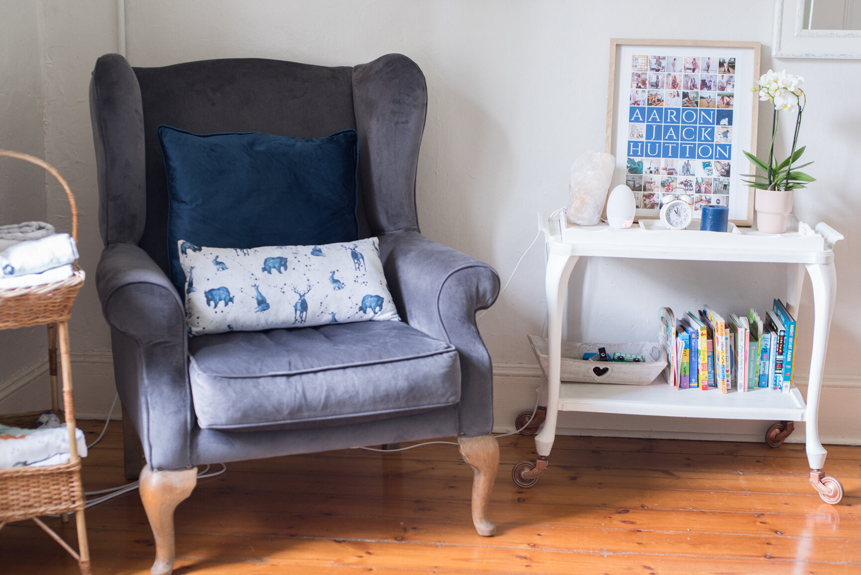
  • Feeding chair: a large wingback bought second hand on Gumtree and recovered

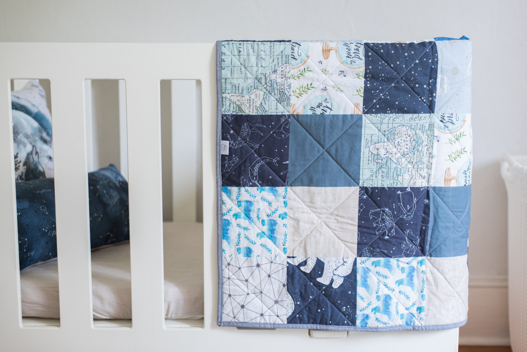
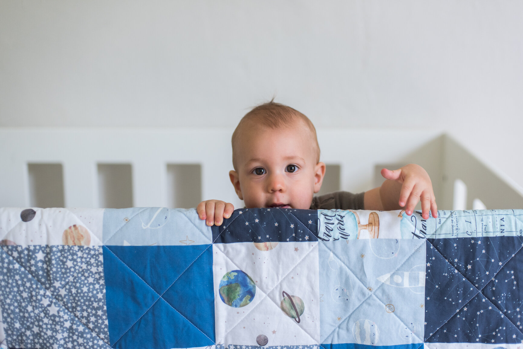
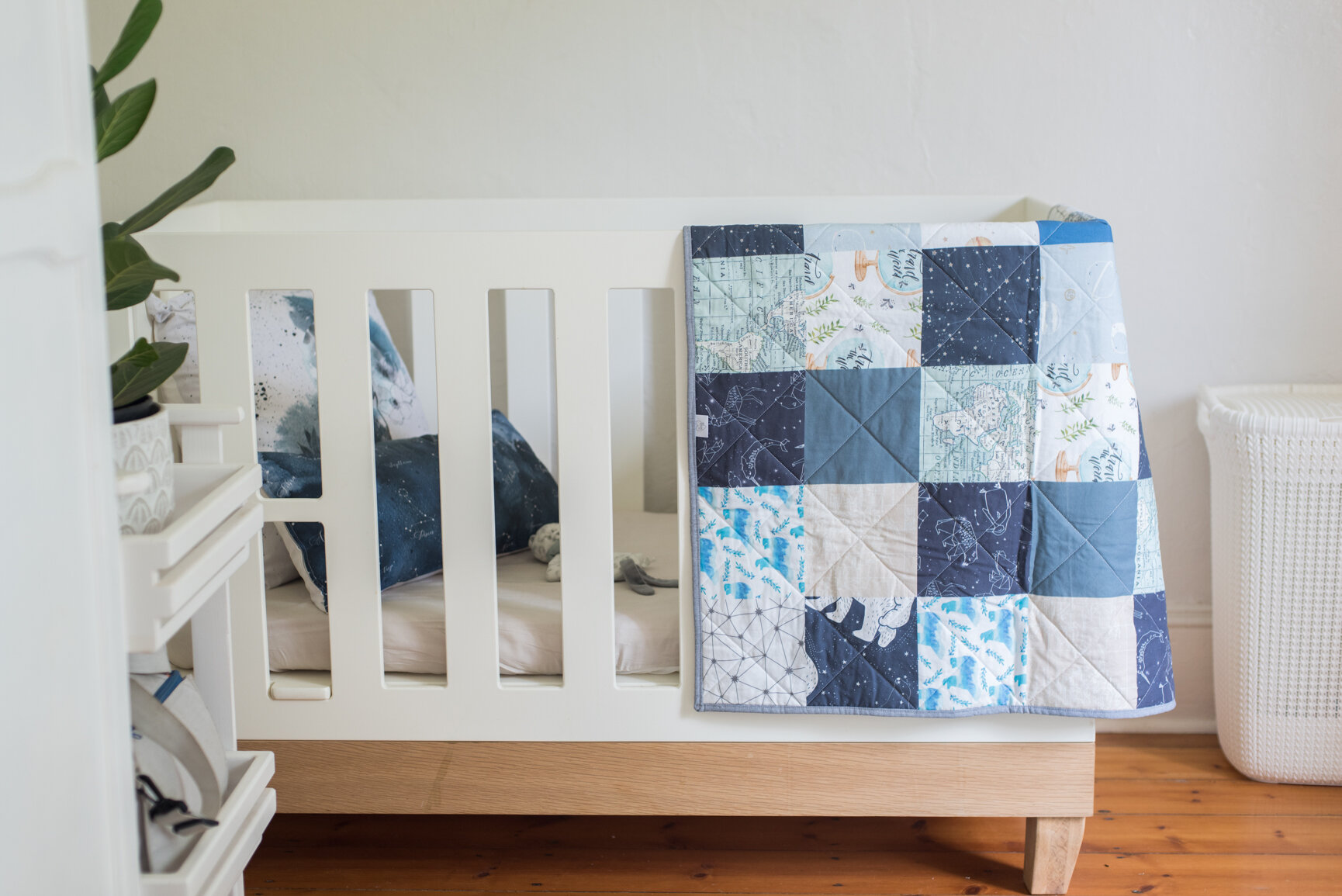
  • Custom quilt:a gift from Love DW (find them on Instagram by clicking here)

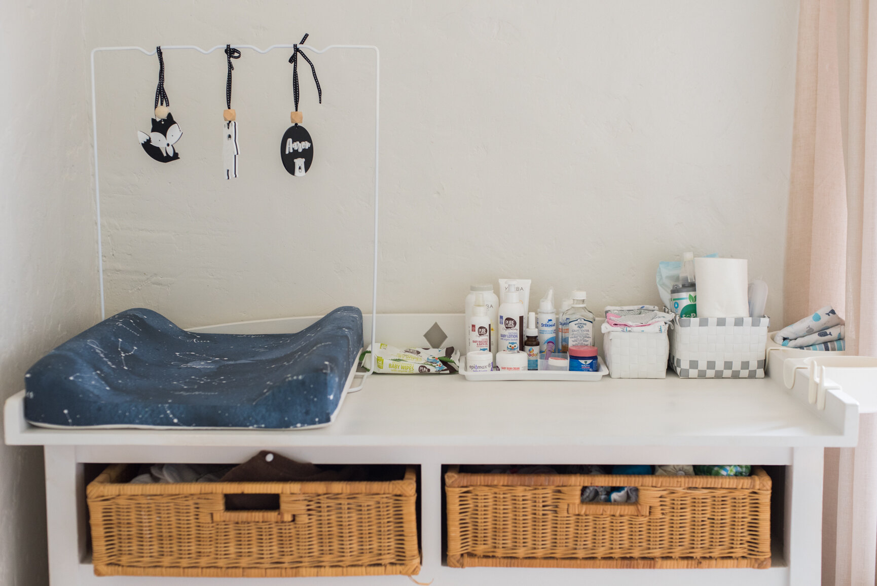
  • Custom designed bedding (scatter pillows, changing mat cover & wall art prints) by Riley & Fox

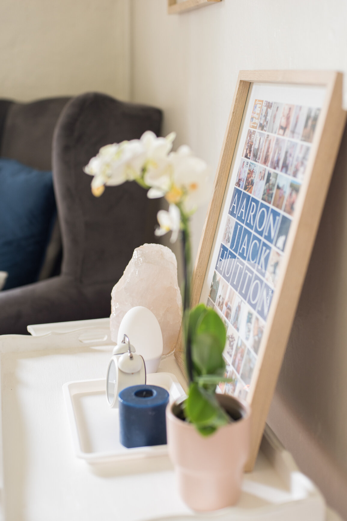
  • Nursery Thermometer Gro Clock: a gift from Tommee Tippee

  • Cot: Cozi Stijl from CoziCot

  • White Quartz Lamp: Crystal Geological at the Bryanston Organic Market in Joburg

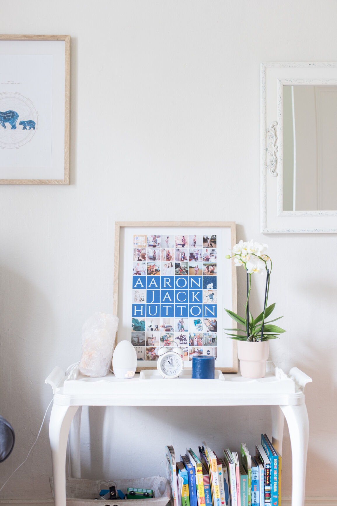
  • Personalised poster: designed by me, printed by Nifty250

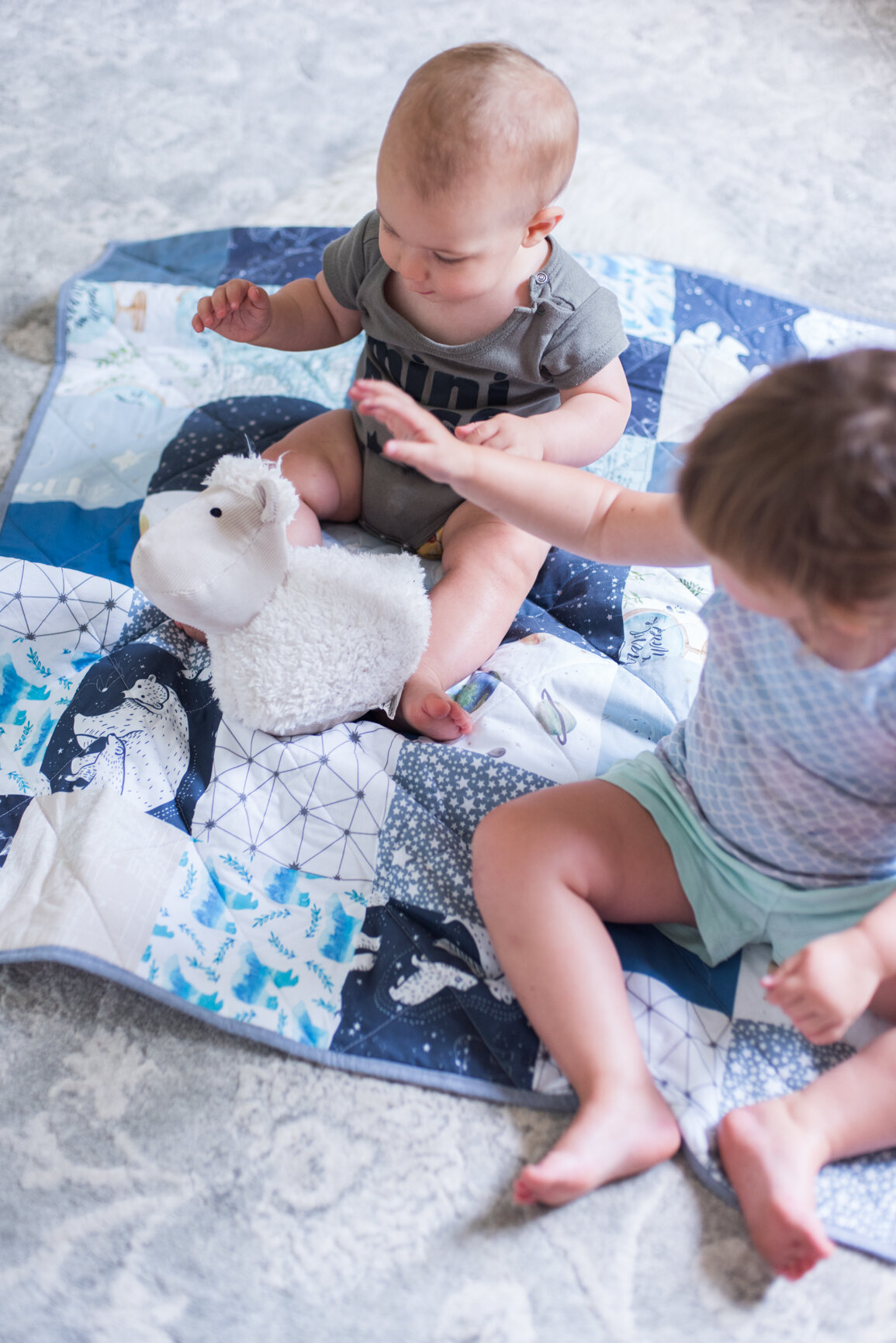
  • Sheep doorstop: Home Etc.

  • Grey rug: Rugs Original

  • White plastic laundry basket: Game

  • Wooden frames: Mr Price Home

  • Large blue satin pillow, blue candle & white clock: Mr Price Home

  • Black & white high contrast change mat dangles: Little Me Decor

Aaron's Modern Celestial Inspired Nursery Baby Room Tour by Roxy Hutton citygirlsearching blog (35 of 37).jpg

I’ve received so many questions from readers as to how I designed & printed the Nifty250 poster, which I’ll share in a blog post soon (hint…I used the Baby App & Canva to design all the graphics and then uploaded them in a specific order to Nifty250. It took a VERLY long time, but was very easy to do).

I hope you enjoyed this post! Look out for a proper tour of Everly’s Woodland themed nursery (I’m only about 2 and a half years late with that one haha) but writing this post has inspired me to go back through my photos and put hers together. In the mean time, click here for a post on her toddler room, and what it looks like now.

Click through below for more toddler blog posts:

High Contrast Baby Mobile Dangle Toys - Little Interiors

High Contrast Baby Mobile Dangle Toys from Little Interiors Photos by Roxy Hutton CityGirlSearching Blog_Artboard 4.png

When starting to plan my little girls nursery, I headed straight to Pinterest and so began my dreams of pretty pastel shades of pink, peach and cream. You see, I was planning a space for ME, not for a teeny tiny newborn who couldn't tell the difference between marshmallow pink and soft apricot. And so, when my step mom told me about the 'gorgeous' black & white mobile dangle toys from Little Interiors she had found at the Decorex show in Joburg, I was sceptical at first.

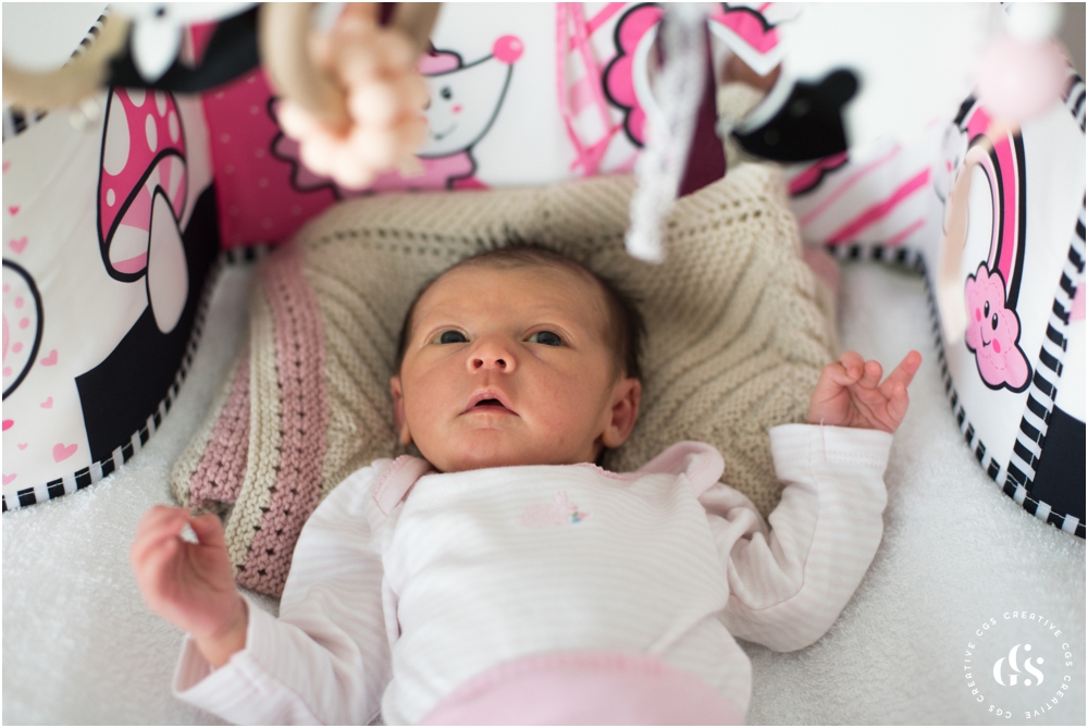
You see...I had already made my own gorgeous mobile dangles (complete with cute kitty)...

baby mobile toy girl nursery newborn toys

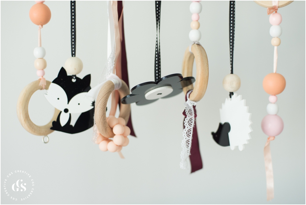
I added a 'high contrast' burgundy ribbon, as I had read that babies are naturally drawn to high contrast colours (like black and white) which, according to this article on visual stimulation by Dr Sears "registers powerfully on baby’s retina and sends the strongest visual signals to your baby’s brain. Stronger signals mean more brain growth and faster visual development" - Dr Sears.

So I thought my little piece of burgundy was going to do the trick and give my little girls endless hours of stimulation on her changing mat. But alas, she was not as taken with my pretty pastel mobile as I was.

I did a little more research into the high contrast mobile dangles from Little Interiors, and found two wonderful post that Mariette has written on her blog. The first post (click here) detailed why high contrast colours are so important for newborn, and the second (click here) went on to show you how you can incorporate high contrast colours into your nursery, even if you've chosen a soft pastel theme for your decor. 

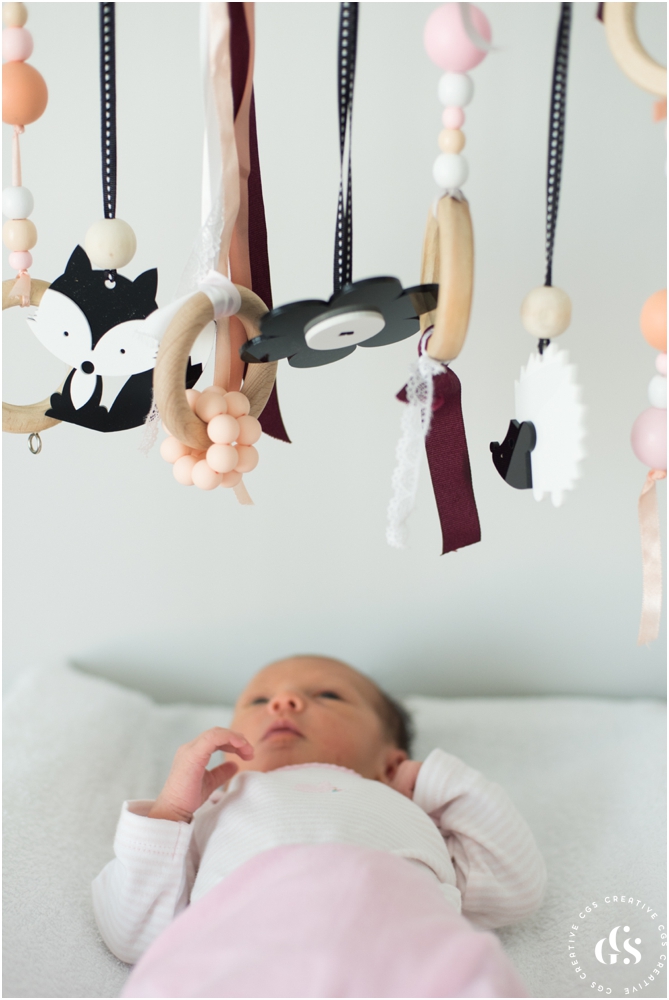
Well, I thought it couldn't add any harm to try adding one of the black and white dangle toys to the mobile (the flower you can see in the picture below), and low and behold, if it hasn't become Everly's absolute favourite toy.

Little Interiors High Contrast Dangle Toys for Newborn Photos by Roxy Hutton of CGScreative & CityGirlSearching (7 of 20).jpg

I also have a set of woodland creatures that hang flat when looked straight at them, but her favourite one has got to be the little flower than hangs flat for her when she's on her back on the changing mat.

Hubby and I are absolutely certain this little flower has magical powers, because whenever she starts crying on the mat, all we have to do is spin the flower and she goes into a trance. It's incredible!

I've since taken down all my pastel dangles, and have just left the Little Interiors black and white high conrast dangles up as those are what she loves (for now).

I'm hoping that in a few weeks time I can put them back up and she'll respond to them.

Otherwise I'll have to find another use for them..any ideas on what I could do with them?

I can't recommend these dangles enough, and there are so many lovely designs to choose from. I'm wanting to add more of the flat hanging ones, seeing as she loves her flower so much.

Well done Mariette on creating such an amazing visually stimulating toys for newborns!

You can shop for the dangles online by >>>clicking here<<<.

In case you're wondering, the change mat mobile frame  is from RubyMelon.

P.S these photos were taken a good few weeks ago, and it's safe to say she is just as in love with the flower now at 10 weeks, as she was at 2 weeks :)


Do you have any toy recommendations for newborns? I know that teeny tiny babies are generally too young for toys, and that homemade things work just as well, but I'd love to know if you have had any experience with toys/decor items that have been stimulating for your little one. Drop me a comment below, I'd love to hear from you!